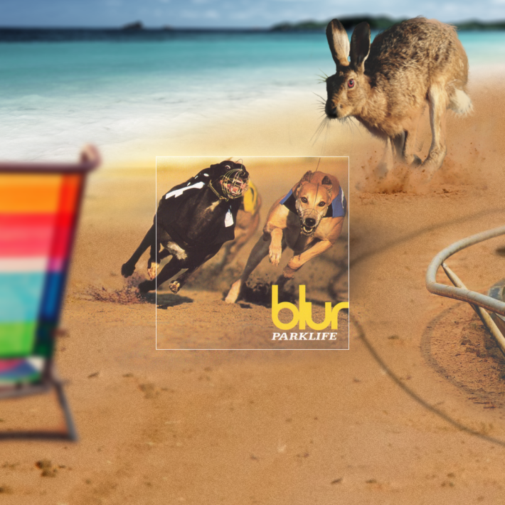
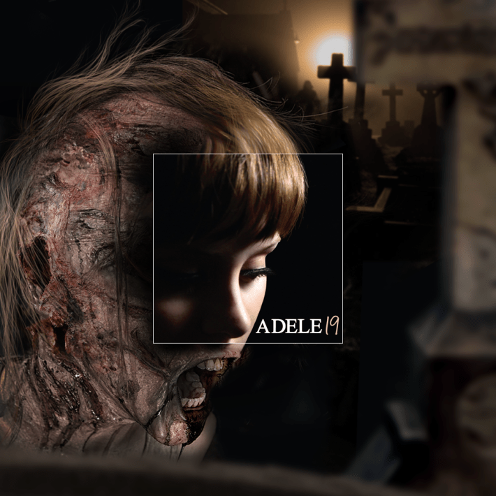
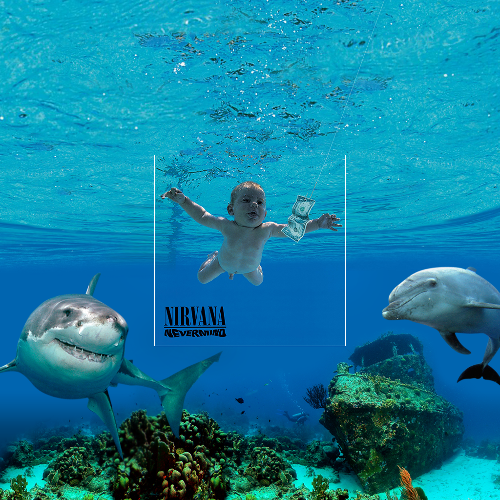
In this era of Instagram, we all know just how easy it is to crop the hell out of a picture to remove from the fringes all unwanted detritus (i.e., our friends) and maximize the attractiveness of the image's primary subject (i.e., ourself). But back in the day you needed a degree in graphic design and $10,000 worth of equipment to even consider such wizardry! Which is probably why we simply accept classic album covers as contained universes, never really considering the broader context in which those images were captured. But not anymore! British design agency Aptitude has taken a handful of album covers and graphically extrapolated what was going on beyond the borders of those images as they were initially presented to the world. Yes, some of them are fanciful, but I'm pretty sure that Adele cover is just about 100% accurate. Check out a few of them in the gallery above, and go here for the full set.

