Many of the greatest hip-hop producers selected which records they would sample based on their album covers. J Dilla, DJ Premier, and Hi-Tek, among others, have all said that if they were captivated by the artwork or found that it hinted at a sound they could use, their instincts were usually right.
Cover art is often an afterthought, but sometimes it can frame a collection of songs so perfectly that it becomes just as memorable as the music itself. It can also build buzz or give us something to gawk at so we can begin to form expectations. Of course, it isn't the deciding factor; if a cover is bad but the music is good, no one's going to stop listening to the music. But when there's a pairing of awesome artwork and music, it's something you live with, not just a square on a phone. It's the image you see before you experience something that can affect your mood, the way you're thinking, how you walk, how you move.
Each of the 10 covers below does that to a different degree in different ways. They're all statements that pair with the music like the perfect wine for a fine meal. This is artwork we'll remember long after the year is over.
10. PUP - The Dream Is Over
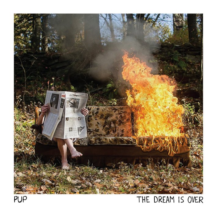
There isn't a piece of album artwork that sums up 2016 better than the cover of PUP’s The Dream Is Over -- read the news about how the world is slowly burning to oblivion and try not to get hit with the flames. Those flames are too close to ignore; everyone feels the heat regardless of race, gender, creed, sexual orientation, or whatever other characteristics you hold on to as part of your identity. A lot of people’s dreams do feel like they’re over, replaced by a nightmare they wake up to every day.
This is not to misrepresent PUP and turn the cover solely into some retroactive representation of a shitty year. But their songs hit so many of the same feelings people will continue to process when the year, like the dream, comes to a close. At times the music is as dark as this year has been, but PUP channel that darkness into fun, or at least exhilaration. The Toronto punks managed to stuff anxiety, anger, despondency, joy, apathy, frustration, and everything else that comes with being young and broke into a 31-minute barrage. The artwork encompasses all of that, because if you can feel the heat, and smell the char, you’re still alive to do something about it.
9. Drake - Views
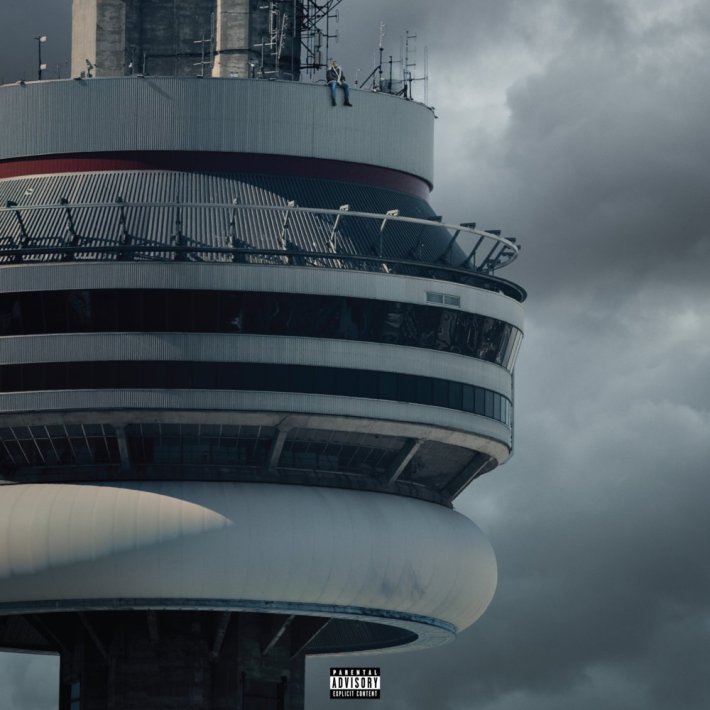
This was the year Drake fell off and became 12 feet tall at the same time. When the proud Torontonian posted the artwork for Views (then still Views From The 6) on Instagram, the interwebs went nuts with it, producing more excitement than the utterly boring album itself could ever dream of. Faulty Photoshop skills begat out-of-wack proportions, and Drake appeared to be a dozen feet tall sitting down on the edge of Toronto’s CN Tower. Drake thereby furthered his reputation as one of the most meme-able artists in the game. It would be assigning too much credit to Drake's team to say they planned the mistake, but the fact that the artwork is so simple and easily manipulated was almost definitely a calculated choice. Meme culture is one of the things that drove Drake's victory over Meek Mill, and it played a hand in "Hotline Bling" skyrocketing in popularity to earn a Grammy nomination. Drizzy knows this. If anyone knows how to take something from a culture (any culture) and exploit it for their own gain, it's Drizzy.
Perhaps reading a little too deeply into the artwork, it works as the perfect metaphor for Drake's status at the top of the rap game. He’s not really there, it just somehow seems like it.
8. Kanye West - The Life Of Pablo
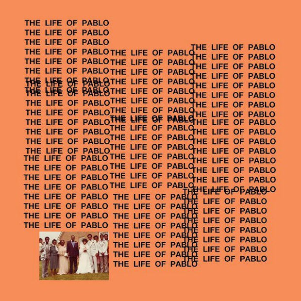
How could we not remember the artwork for the living, breathing document that is The Life Of Pablo? Unfortunately, it may come to symbolize the year we watched Kanye West's mental health spiral right before our eyes, but it was also memed as much, if not more, than Drake's Views artwork. A spate of tools that allowed you to create your own cover even showed up right after Pablo's release, and that made it seem like some crude creation, but 'Ye was touting it like Peter de Potter's work was genius. That sums up Kanye’s reception as an artist to a tee in 2016. It seems you either love him or hate him. Either he’s a genius across multiple platforms or a self-aggrandizing hack. Or maybe you loved him way back when, and you hate him now, or vice versa. No matter how you slice it, there seems to be no in-between. Hopefully, 2016 won’t go down as the year Yeezus lost his mind, or his marriage dissolved, or he fell off completely as an artist. But when we look back at Kanye’s career further removed from his omnipresent over-saturation in the media, this album and its artwork will be a pivotal point of reference.
7. Chance The Rapper - Coloring Book

That damn "3" hat is going to be ingrained in many a brain until "4" drops. Chance didn’t even take that fitted off to perform at the White House or film his Kit Kat commercial. The way he branded this project on his "Ultralight Beam" verse (#1 on our Best Rap Verses Of 2016 list), and then etched that hat into our eyelids so we saw it every time we blinked, is genius. Sure, he met Kanye West so he’s never going to fail, but he also has an uncanny ability to maximize the magnitude of a moment by exceeding extremely lofty expectations every time. So every festival appearance, concert appearance (whether his own or another artist's), video, song, or whatever else felt huge. Then to top it all off, he makes history at the Grammys with three nominations for a stream-only project. None of this would be possible if Chance weren't the tireless, talented, unabashedly joyful individual he is, but putting that "3" hat on top of his lanky frame in the album artwork definitely helped set off his unbelievable 2016.
6. Radiohead – A Moon Shaped Pool

Every part of the rollout for A Moon Shaped Pool felt like a huge event: every song, every video, every show announcement, every festival announcement ... everything. So of course, the artwork is too.
In an interview with The Times Literary Supplement, Stanley Donwood, who’s done Radiohead artwork for over two decades now, revealed how he came up with what would finally be the cover. Donwood set up numerous canvases on a large grange outside of a barn, each with abstract splashes of color. He set up speakers in the barn and wired them to the recording studio where the band was working. He heard each and every move the band was making while creating their album, and mirrored their movements, reacting in acrylic to what moved him sonically. Then he chose which of those pieces would be the final cover, took a photo of the work, and manipulated the image until it was to his liking. He created over 40 pieces to find the one that would eventually make the cover, and included 32 of them in the special edition.
Donwood's process is probably the most elaborate for any cover art this year, except for maybe Bon Iver's 22, A Million. On both accounts, this kind of intention and care can be perceived as pretentious, and that largely leads to the division of fans and haters. No matter what side you happen to fall on, you’re going to pay attention. Isn't that what art, or 32 pieces of art, is about? Time will tell how people remember this album and its artwork, but we'll remember both nonetheless.
5. Solange - A Seat At The Table

Solange’s subtlety is a huge reason why A Seat At The Table works. Most people expected a harsh tongue-lashing in what it means to be "woke," but instead she came with an album brimming with empathy, understanding, pride, forgiveness, sadness, anger, and seemingly every other emotion known to man. This humanized Solange to a lot of people who thought her abrasive social media presence defined her. Her art director and photographer, Carlota Guerrero, managed to capture everything in a simple but stunning portrait of the artist. What really registers, though, is how simultaneously subdued and potent the image is. The other unapologetically black albums that have come out over the past few years feature imagery with a much different energy spawned from righteous anger. Kendrick Lamar’s To Pimp A Butterfly has a white judge presumably stomped out by a group of black men in front of the White House. D’Angelo And The Vanguard’s Black Messiah featured proud black power fists and hopeful open black hands in staggering numbers. Vic Mensa recalled Muhammad Ali’s famous Esquire cover photo by portraying himself as a target-practice dummy for There’s Alot Going On. Solange made an equally powerful statement with just a photo of herself.
4. Soft Hair - Soft Hair
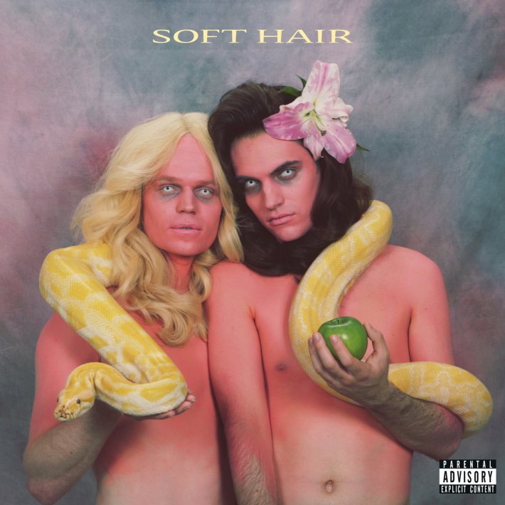
This artwork is the stuff "woke" nightmares are made of. Connan Mockasin and Sam Dust outdid themselves on the cover of their introductory full-length as Soft Hair. Mockasin has never been one to conform to societal norms, and is consistently brazen in his quest to challenge what people believe. Dust is cut from the same cloth. The two of them are responsible for some of the most singular music in the last decade individually, but together they push the limits even further, folding multiple genres and their individual sensibilities in on each other like origami to make gorgeous songs. The inventive, experimental quasi-pop they make embodies their personas perfectly, and they captured what they represent with those personas on the cover of their self-titled debut just as well.
In a stroke of genius, they flipped imagery from the same bible that many people use to legitimize hating queer people to accentuate some good old-fashioned punk androgyny that Iggy Pop would be proud of. The photo is so disorienting, creepy, and beautiful all at once that it’s impossible not to be mesmerized. Who’s Adam? Who’s Eve? (Like it matters?) Which of the two of them would give the other the forbidden fruit? Why are both of them as comfortable as they are with the snake -- which, by the way, looks a lot like the one from Britney Spears' iconic "I'm A Slave 4 U" performance at the VMAs? Is that a sunburn from actually traveling in time and being directly underneath the harsh rays illuminating the Garden Of Eden? Did they take a shot at the cringe-worthy, forced normalcy of prom with that classic yearbook backdrop? What’s with the creepy contacts? How could this simultaneously be straight out of the '80s and be so damn progressive? This may have been the year an overgrown Oompa Loompa was elected president, the first woman to run for president sadly didn’t become president, too many icons were lost, and far too many black men were killed by police, but when we look back on what the music of this era felt like, this cover will be one hell of a reminder.
3. D.R.A.M. - Big Baby D.R.A.M.
Charlamagne Tha God eloquently described the state of sexuality and emotions in rap three years ago in an interview with Vlad TV: "There’s gay, straight, and Drake." Drake has been rap’s resident softy since his proper debut Thank Me Later dropped in 2010, and some thanks are owed to him for allowing rappers to unabashedly tap into their emotions and express them on wax.
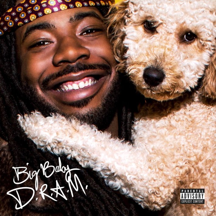
Without Drake, D.R.A.M.’s mile-wide smile on the Big Baby D.R.A.M. cover wouldn’t be as big, and Idnit, his utterly adorable Goldendoodle pup, wouldn’t be with him. Despite being a genre that values authenticity over almost everything, rappers have had to suppress parts of their individual personalities to perform the tropes that have existed for decades. Post-Aubrey, rappers are slowly but surely displaying all facets of complex personalities in their music, finally just being the full people they are in real life.
D.R.A.M., at heart, is still the happy-go-lucky, unrelentingly joyous kid in his “$” video, who was goaded to sing at family reunions and church functions. That kid is exactly who we see on the cover of his album, and he can be that kid and not have to remain underground for the entirety of his career. Sure, using cats' and dogs' cuteness is always borderline exploitative and appealing to the lowest common denominator, but not when it feels authentic. This isn’t some dog GIF list thrown together for clicks; it’s D.R.A.M being himself, displaying a part of his life that he actually lives. It’s not farfetched to imagine running into D.R.A.M. and Idnit having fun on a walk in Virginia. It’s also not hard picture him telling women he thinks they’re cute, being a workaholic all about his money, or just getting lost in thought while enjoying the sweet VA breeze.
It’s about time rappers could be unapologetically happy without being labeled cornballs or worse. When people talk about the time when that first started to change, this album cover will certainly be a part of the conversation.
2. David Bowie - ? (Blackstar)
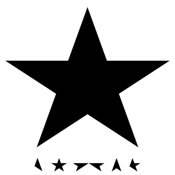
The man, the legend, the genius, the influencer, the meticulous this-is-how-you-leave-the-fucking-planet planner. David Bowie has had plenty of iconic artwork over the span of his damn near 40-year, 27-album career. Other than maybe Aladdin Sane, Blackstar will be the cover that we remember most.
As if Bowie didn’t give us enough to marvel at while he was alive, he continues to do so posthumously. There’s already so much to unpack musically and contextually on this album, but even the artwork seemingly has more levels to it than Candy Crush. People went nuts over the fact that the vinyl sleeve was made with translucent material that reveals a star field within the main star when exposed to light. But recently the designer of the artwork, Jonathan Barnbrook, revealed that there are even more secrets:
There are a number of black stars in the album as well. It’s not just the five-pointed star on the front. And they do symbolize different things in life. For instance, there’s the rosette which looks a little bit like a price tickets. That’s to say, well, this is still a commercial product, you still buy it. There’s the guiding star, the idea of a person who you follow in your life or the idea of something spiritual which music gives you. So there are a lot of other things going on which aren’t absolutely at the surface, but I do hope people see them. And not necessarily straight away, as well.
And in true Bowie fashion, citing the late, inimitably great artist’s belief in never explaining things, Barnbrook said this: "There’s one big thing which people haven’t discovered yet on the album. Let’s just say if people find it, they find it, and if they don’t, they don’t."
Of course there’s one more thing. There always will be. We’ll never truly understand everything about a man and artist who operated on a plane in another realm even while he was on Earth.
1. Young Thug - No, My Name Is Jeffery
There’s a questionable history of black male entertainers wearing dresses. Young Thug is far from the first to don one. Black actors, comedians, and athletes have dressed in drag for decades, playing up to expectations set by white directors, producers, and writers in industries ruled by white men. A short but far too long list is: Flip Wilson as Geraldine, Richard Pryor as Jo Jo, Wesley Snipes as Noxeema, Jamie Foxx as Wanda, Eddie Murphy as Rasputia and Grandma Klump and Mama Klump, Tyler Perry as Madea, Martin Lawrence as Sheneneh and Big Momma, Brandon T. Jackson as Charmaine Daisy Pierce, Keenan Thompson as Virginica Jones and many others, Shawn and Marlon Wayans as the Wilson sisters, Arsenio Hall in Coming To America, Ving Rhames as Holiday Heart, Miguel A. Nunez Jr. as Juwanna Mann, Chiwetel Ejiofor as Lola, Larry Johnson as Grandmama, Chris Tucker as Ruby Rhod, LeBron James for Progressive (ironic), Kevin Hart on SNL, Terry Crews for Old Spice, and Charles Barkley for Weight Watchers.
Chris Rock said that it’s hard to thrive in Hollywood as a masculine black man with "a goatee and bass in his voice." Dave Chappelle described his staunch refusal to wear a dress on Oprah, and talked about how he was labeled as "difficult" because he wouldn’t follow in the footsteps of "the greats" who did it before him. Kevin Hart knew the implications and history of wearing a dress as a black comedian, and adamantly stated he would never wear one, but conceded on SNL. Many believe that Richard Pryor had to sell himself in drag for the chance to get his only directing credit, Jo Jo Dancer, Your Life Is Calling. Male actors, especially comedians, of all colors have worn dresses for laughs, but there is something different about an industry controlled by white men asking or demanding black men do it to succeed.
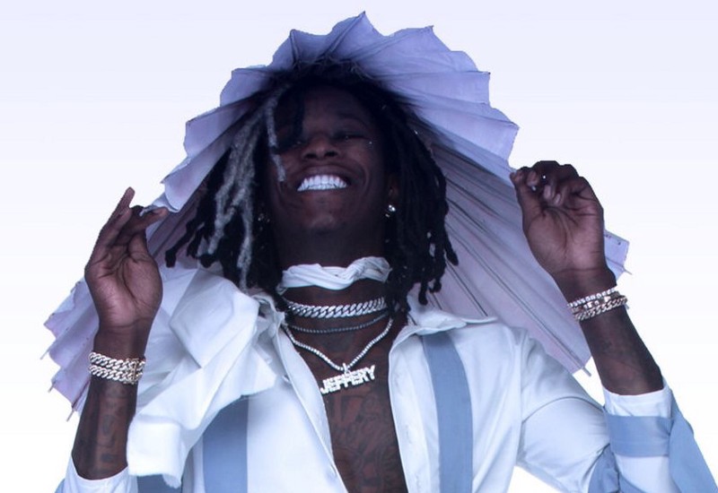
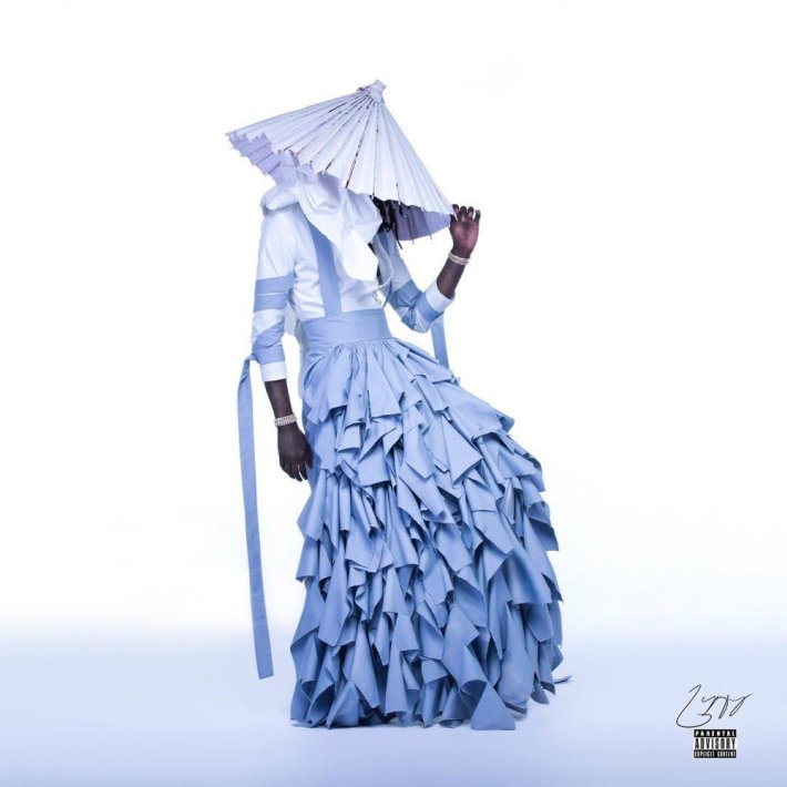
Thugger continually subverts the norms of how a rapper should address gender, sexuality, and identity, occupying a position that exists between the masculine and feminine with fluidity. He often refers to his peers as hubbies and regularly uses language that is traditionally seen as feminine when describing interactions with them. Yet he can brandish guns and talk tough on Instagram when beef needs to be cooked. The Atlanta rapper has been somewhat of an anomaly in the rap world for years now, but nothing has quite been as striking as the cover of No, My Name Is Jeffery.
Here he is proudly choosing to wear a dress as a black man on his own terms, though it has been forced upon his predecessors. And Thug is not just a black man, but also a rapper -- an occupation traditionally steeped in much more machismo, homophobia, and misogyny than other fields. He’s flipping each of those rap motifs on its head, embracing all of the hate that will come with it while propagating it as well in his music. He constantly talks about all the women he juggles and his sexual prowess, made a song that emphatically states that he’s not gay, and is quick to talk gunplay. All of those contradictions are present on this album cover, one that pushes the limits of what a rapper should walk, talk, act, and dress like to extremes that can affect change. Aside from all that sociopolitical subtext, it’s also just a beautiful, well-executed photo. Thug is draped in a gorgeous, sky blue, "skirt-like" garment from Italian designer Alessandro Trincone’s Annodami collection, which was inspired by Japanese kimonos and trousers.
Who would have ever thought a rapper with Thug in his moniker would be bending gender and sexual norms into submission on an album cover? Twitter only went crazy over it for a day or so, but this will retrospectively be a huge moment in rap history, cultural history, and history in general.
