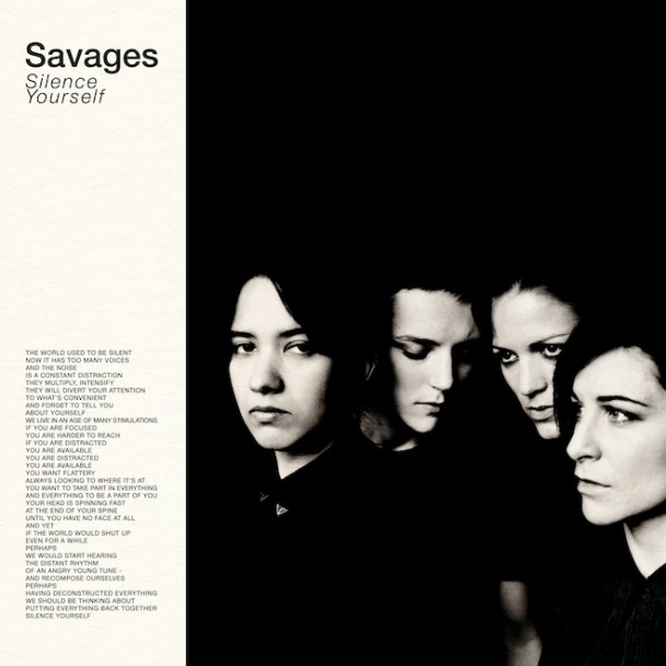
Late last night/very early this morning, Sufjan Stevens took to Tumblr to lambast the type design on the cover of the critically-beloved Savages' LP Silence Yourself. In the brief post, he wrote:
The very cool SAVAGES has allowed a very uncool typographical blunder on its LP cover: Helvetica Narrow (weight loss is the worst thing that can happen to an iconic font, aka iOS 6). Also can we talk about the weird italics (unnecessary affectation, and very un-British), cramped leading (totally unforgivable) and unnecessary line break? Who the Fraggle designed this?
I don't deign to know too much about design, but I've gleaned a bit from friends who do it for a living and I can tell you, Sufjan's not wrong to call this pretty bogus. Check out how the close the "Y" in "Yourself" is to the "S" in "Silence" but how far, albeit by a teeny tiny bit, the "l" in "Yourself" is from the second "e" in "Silence": Looks weird. He followed up this design issue post with a second about the "ALL CAPS manifesto" also on the LP's cover:
One more thing about this album: the awkward blatancy of an ALL CAPS manifesto (with line breaks) on the cover is, on one hand, a bold move (typographically), and, on the other hand, an indication of restraint and self-possession (compared to the explicit cover design of most punk/rock albums; compared to the explicit cover design of my albums, always screaming for attention). Case in point: the inherent democracy of ONE CASE (every letter equally measured) forgoes the political hierarchy of upper/lower class. Am I reading too much into this? The band has somehow achieved mystery and modesty in brash exclamations about “silence” (resonance of Buddhism?) rendered via typographical faux pas (all caps=yelling). (What would E.E. Cummings do?) Context is everything: punk sermons situated beside a muted black and white photo (evoking the band in stillness, slightly pissed off) provoke visual tension and/or situational irony, a reflection of the band’s sound and style (silence vs. noise). Restrained Aggression. Aggressive Restraint. Clean lines, crisp utility, minimalism, functionality. These are also the qualities of a good font, Helvetica being the supreme deity, and Futura Medium a minor prophet. (Times New Roman may as well be the air we breathe.) I recall in writing workshops the constant admonishment to allow your prose to disappear, so that the narrative became an “illiterate experience,” transcending the text itself, magnifying in ether (the magnitude of all things communicated by nothingness, i.e. silence). To accomplish this on the page (or in a song, or on an album cover) is one thing; to live it is nothing less than enlightenment. Thank you, Savages, for the urgent all caps homily (to “recompose" ourselves in silence). I will never forgive your awkward italics, but I will forever sing your anthems to my children’s children.
Sufjan does like to use his Tumblr occasionally to point out grammar errors and the like, but it seems this is his first major kerfuffle regarding another artist's work. I do hope that, if this spurns any kind of beef, that Savages will never forgive his capitalization of e.e. cummings's name, but will forever not be mad at his typeface nerdery.
